Category: Data Viz
-
Explore Your Music (Part 2)

In this post, let’s explore your music library with Python! Reflections In my last tutorial, the focus on complicated XML parsing drained some of the fun from playing with our data. Also, I missed some important facts about the dataset when trying to draw conclusions from my data. I uncovered this oversight trying to understand Read more
-
Explore Your Music Library with Python

Hi all! ‘Tis the season for Spotify Wrapped, that is, if you subscribe to Spotify. I used to, but I left for two reasons: The algorithm was not good enough at making recommendations that stuck with me long-term, and the delays in their lossless audio options. However, this means I miss out on the annual Read more
-
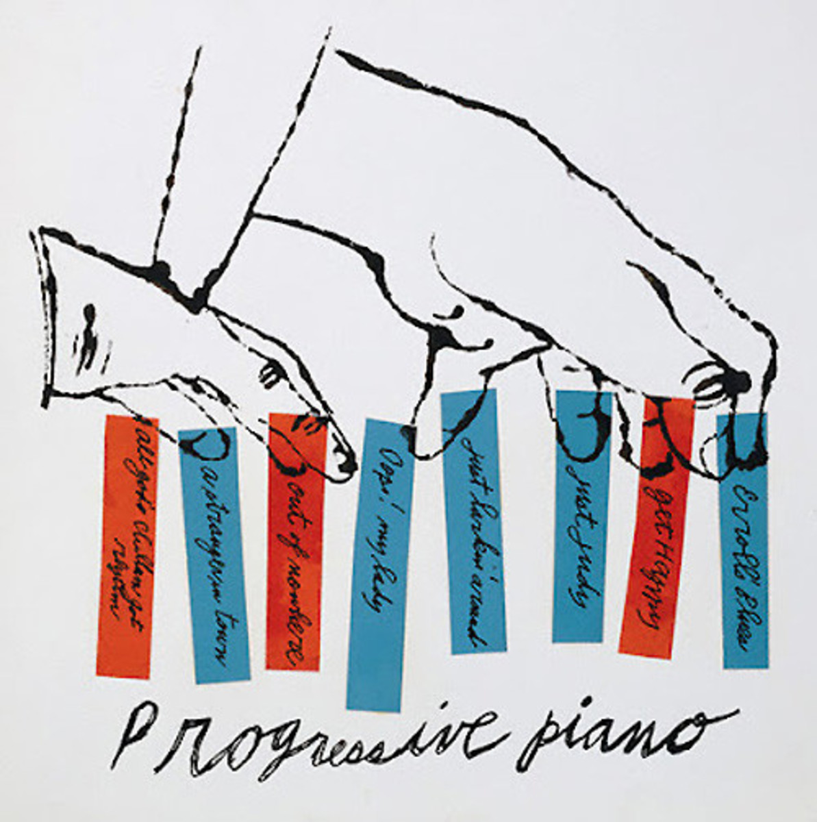
Searching for Jazz
I may have mentioned in one of my first posts that one of my long-term goals is to create a music discovery/recommendation algorithm. The music streaming apps are great at managing playlists and streaming music. But I want a seamless experience for discovering new music. And, without having to listen to the full song, I Read more
-
Predicting Jazz Genres with XGBoost Classifiers
Introduction Welcome to the first tutorial post on my blog! Any post that I tag “Tutorial” should suit a wider audience, and I hold to a higher standard for reproducibility. I want to eliminate the problem of developers searching for answers in documentation, but things don’t quite line up with how their system is set Read more
-
Sci-Fi Novel Data Visualization
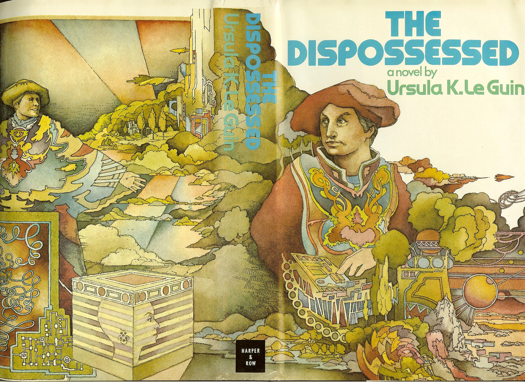
I collected Wikipedia articles for nearly 900 science fiction novels, and clustered them via the TF-IDF and k-means algorithms. The dimensions are reduced for visualization via t-SNE, the colors represent the k-means clusters, and the dot size represents the prominence of an article among the other data. Read more about the methodology at this post. Read more
-
The New Jazz Album Data Visualization (Portfolio Edition)
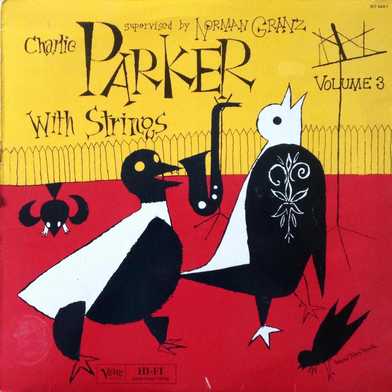
For the previous version of this visualization, see my old blog post here. I wanted to both improve the quality of the code and the visualization. See this post for more details. In short, this is a visualization of Wikipedia articles on jazz albums clustered via TF-IDF and k-means techniques. Colors represent k-means clusters in Read more
-
Revisiting the Jazz Album Data Visualization

I missed something in my initial critiques of my previous jazz album data visualization. For ease of reference, I’ll re-embed the graph I’m discussing here: Overall, I think this scatter plot does a good job illustrating the dataset of Wikipedia articles on jazz albums. There are clusters that group similar albums and appealing colors that Read more
-
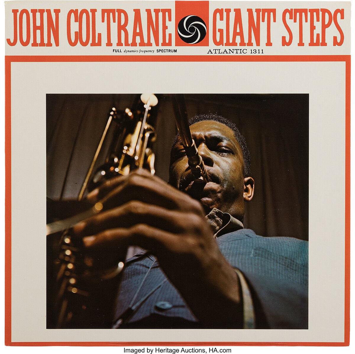
Is Jazz Dead?
Background Recently, I attended a concert by Marcos Valle put on by the record label Jazz Is Dead. It reminded me to make good on my promise to upgrade my jazz data projects by extracting new data from the wiki pages. The main obstacle to doing this at the time I extracted the data was Read more
-
A Wiki Crawling Reflection: The Return of L. Ron

Introduction Hey all! Maybe you’ve seen my previous post on visualizations of jazz-themed Wikipedia articles. I also posted the code for the project here on GitHub. I just wanted to go behind-the-scenes a little on how that project works and brainstorm some of the other things you can do with it! Some of this, I Read more
-
Two Graphs on Jazz with Free Data Scraped from Wikipedia
Explanation: For this visualization, I scraped 6064 Wikipedia articles for jazz or jazz-related albums, and clustered the articles according to similarity using TF-IDF and t-SNE for getting the 2-D position of the album on the graph – and using k-means for the point colors. Insights & Future Directions: Explanation: This is a doughnut chart that Read more